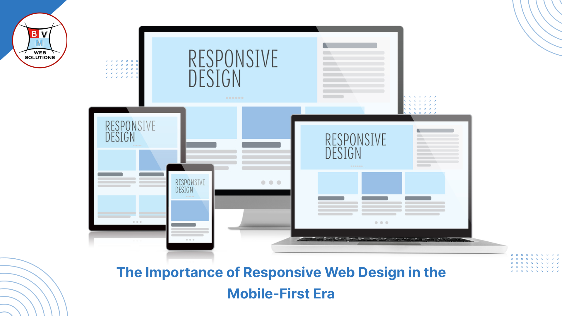
The Importance of Responsive Web Design in the Mobile-First Era
Users visit websites using a range of devices, such as smartphones, tablets, laptops, and desktop computers, in today's fast-paced digital environment. Because mobile internet usage is becoming more and more common, companies need to give responsive web design top priority in order to guarantee a flawless user experience. In the mobile-first age, this article examines the significance of responsive web design and why it is crucial for companies looking to thrive online.
Web design that is responsive: what is it?
A method to web development known as responsive web design (RWD) makes a website adjust to various screen sizes and devices. To provide the best possible viewing experience on all platforms, it makes use of scaled graphics, media queries, and adaptable grids. A single website may dynamically adapt to numerous screen resolutions thanks to responsive web design, which eliminates the need to create distinct designs for different devices.
Mobile-First Design's Ascent
Search engines and companies are moving toward a mobile-first strategy since mobile devices account for more than 60% of all web traffic worldwide. Additionally, Google has adopted mobile-first indexing, which gives preference to a website's mobile version when indexing and ranking it. Non Mobile-friendly websites run the danger of having lower search engine ranks, which will reduce their visibility and visitors.
The advantages of web design that is responsive
1. Improved User Experience
A responsive website with good optimization offers a seamless and easy-to-use user experience. Without having to scroll or zoom in too much, visitors can read text, navigate, and interact with items with ease. Higher engagement and decreased bounce rates are the results of a smooth experience.
2. Higher Search Engine Rankings
Mobile-friendly websites rank higher in Google's search results. Improved SEO performance and increased visibility in search engine results pages (SERPs) are guaranteed by responsive site design. Furthermore, keeping a consistent URL structure enhances link-building and indexing effectiveness.
3. Efficiency in Time and Cost
Responsive design enables companies to manage a single website rather than creating and maintaining distinct desktop and mobile pages. As a result, less money is spent on development, upkeep, and the creation of duplicate material.
4. Higher Rates of Conversion
The user journey is improved with a mobile-friendly website, which makes it simpler for users to finish tasks like making purchases, completing contact forms, or signing up for newsletters. In the end, this results in increased revenue and better conversion rates.
5. Quicker Page Loading
Both SEO rankings and user retention depend heavily on page speed. All devices will load more quickly thanks to responsive design, which guarantees optimal graphics, effective coding, and appropriate media queries.
6. Making Your Website Future-Proof
With the frequent release of new gadgets and screen sizes, technology is always changing. By using a flexible web design approach, you may minimize the need for repeated redesigns by making sure your website can keep up with future technological developments.
How to Put Responsive Web Design Into Practice
The following crucial components should be the focus of developers and designers in order to create a responsive website:
- Fluid Grid Layouts: To guarantee that elements scale proportionately, use percentage-based widths rather than fixed pixels.
- Flexible Media and photos: Make sure your photos are scalable and can be resized to fit various screen sizes without causing distortion.
- Use CSS Media Queries: To modify design elements according to device type and screen resolution.
- Mobile-Friendly Navigation: For better usability, make use of touch-friendly buttons, responsive menus, and collapsible navigation.
- Performance Optimization: To improve loading times, reduce superfluous code, make use of caching, and make use of content delivery networks (CDNs).
Conclusion
It is now essential to have responsive web design in the mobile-first age. Improved user experience, better search results, more engagement, and higher conversion rates are all advantages for businesses that adopt responsive design. Investing in a responsive, mobile-friendly website guarantees long-term success in a cutthroat online market as the digital landscape changes.
Is your website prepared for the age of mobile devices? For a responsive, user-friendly website that produces results, get in touch with us right now!

.png)

